Vyn Lab is a brand studio between Scandinavia and Australia, based in Brisbane, building identities, websites, search and photography in one room for brands that care how they are seen. Recent projects include work for Anook & Co, Project 02, and Project 03.
Selected
Work
All Work
Vyn Lab is a full-service brand studio started by a designer and a photographer. Vyn is Swedish for view: how a place, a product or a person is seen. We make brands, websites and search presence, and shoot every image ourselves, so a brand looks the same in its logo, on its site and in its photographs. Our work sits between Scandinavian restraint and Australian light, at a price that makes sense for independent businesses.
Information
Contact
New Business
Photography
Capabilities
Industries
Experience
- Nordbeam, Scandinavia
- Independent Nordic brands
- A leading Australian brand agency
- Fine art and architecture photography
The View
Vyn is Swedish for the view. It is the idea we work from: a brand is not what a business says about itself, it is how it is seen. Perception decides who stops, who trusts and who pays, so our job is to make that view distinct enough to stand apart in a crowded market.
Not For Everyone
We take on a handful of clients at a time, and the people in the first workshop are the people who write the strategy, draw the identity, build the site, plan the search and take the photographs. No hand-offs, nothing outsourced.
What We Do
Brand Strategy
Who the brand is for, what it stands against and what it should be known for, written in words the whole business can use.
Naming
Names for companies, products and places, checked for meaning in English and Swedish, and for domains and trademarks.
Visual Identity
Logo, type, colour and layout, designed as one system that holds from a business card to a shopfront.
Art Direction
A point of view for every image, campaign and launch, so the brand looks deliberate everywhere it shows up.
Website Design
Sites designed around how people actually decide, with the brand carried into every page and interaction.
SEO & Content
Search planned into the structure and the copy from day one, so the right people find you.
Photography
Architecture, interiors, product and people, shot by Jack in natural light, so the pictures and the brand agree.
Film & Motion
Short films and motion for launches, sites and social, shot and edited by the same team.
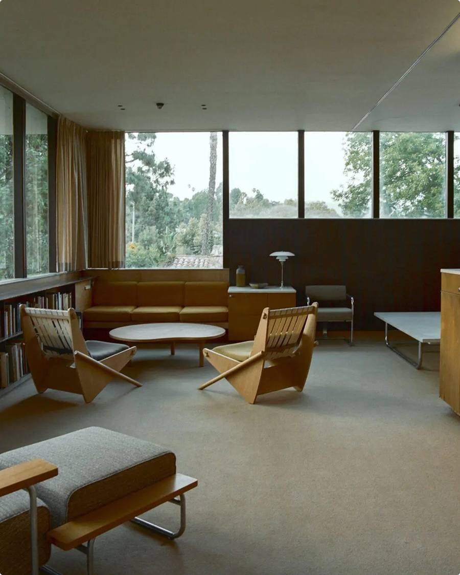
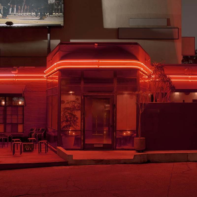
 Placeholder
Studios
Brisbane
Australia
Home studio and shoots
Stockholm
Sweden
Where the view started
Tell us what you want to be seen for.
A few lines is enough: who you are, what you are working on and when it needs to be ready. We reply within two working days, from Brisbane or Stockholm.
hello@vynlab.comDetails
New Business
Photography
hello@vynlab.com
Architecture, interiors, product
Brisbane
Australia, home studio
--:--:--
Stockholm
Sweden
--:--:--
Useful To Send
- Where you are now
- What needs to change
- Timing and budget range
Anook & Co Launches With Its Own Shoot
Identity, website and two days of photography for a Japanese steel kitchen system, all made in-house.
Oct 2026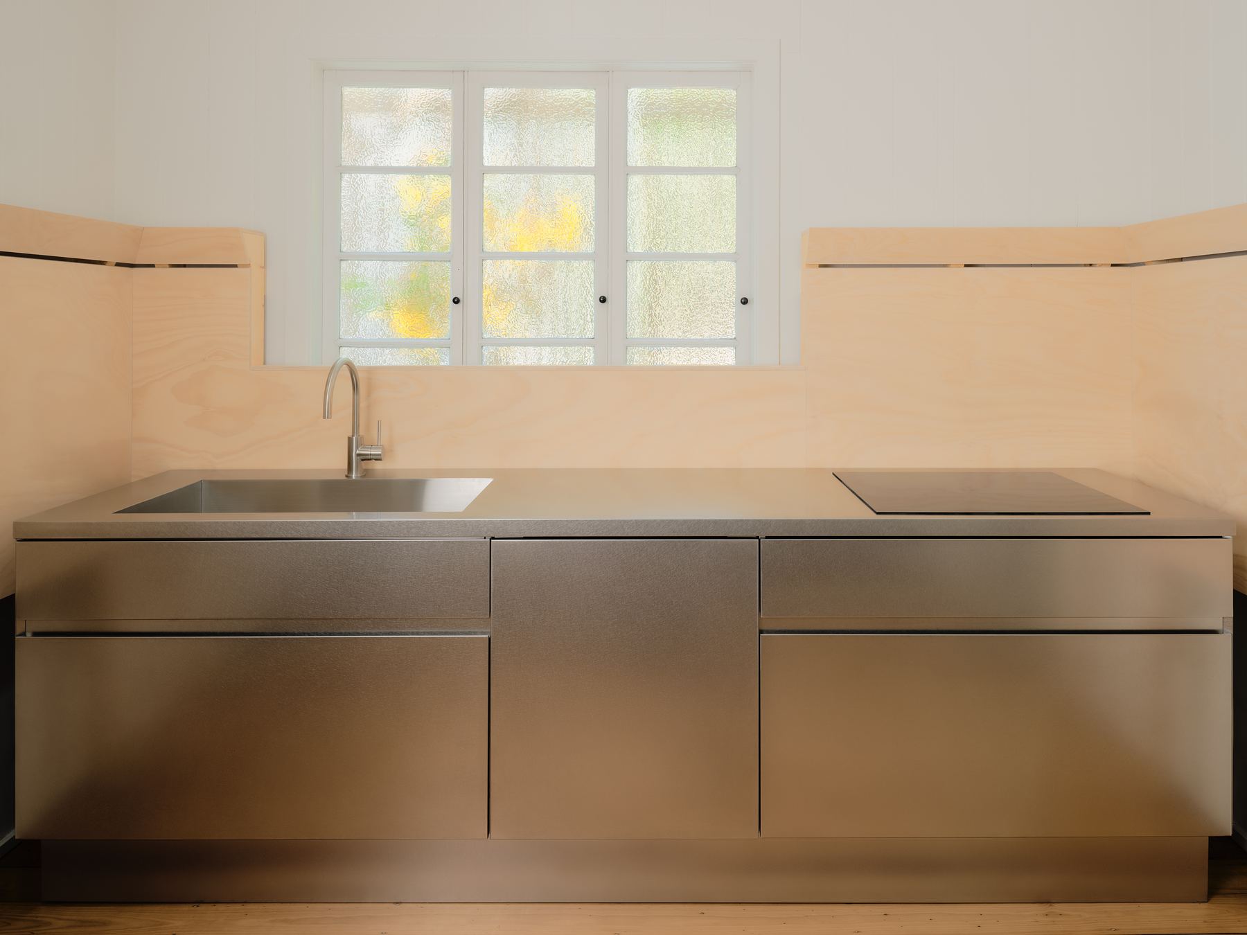
All Journal
Anook & Co,
Japanese steel kitchens for Australian homes.
A kitchen made of steel and plywood, given a brand as quiet as its materials.
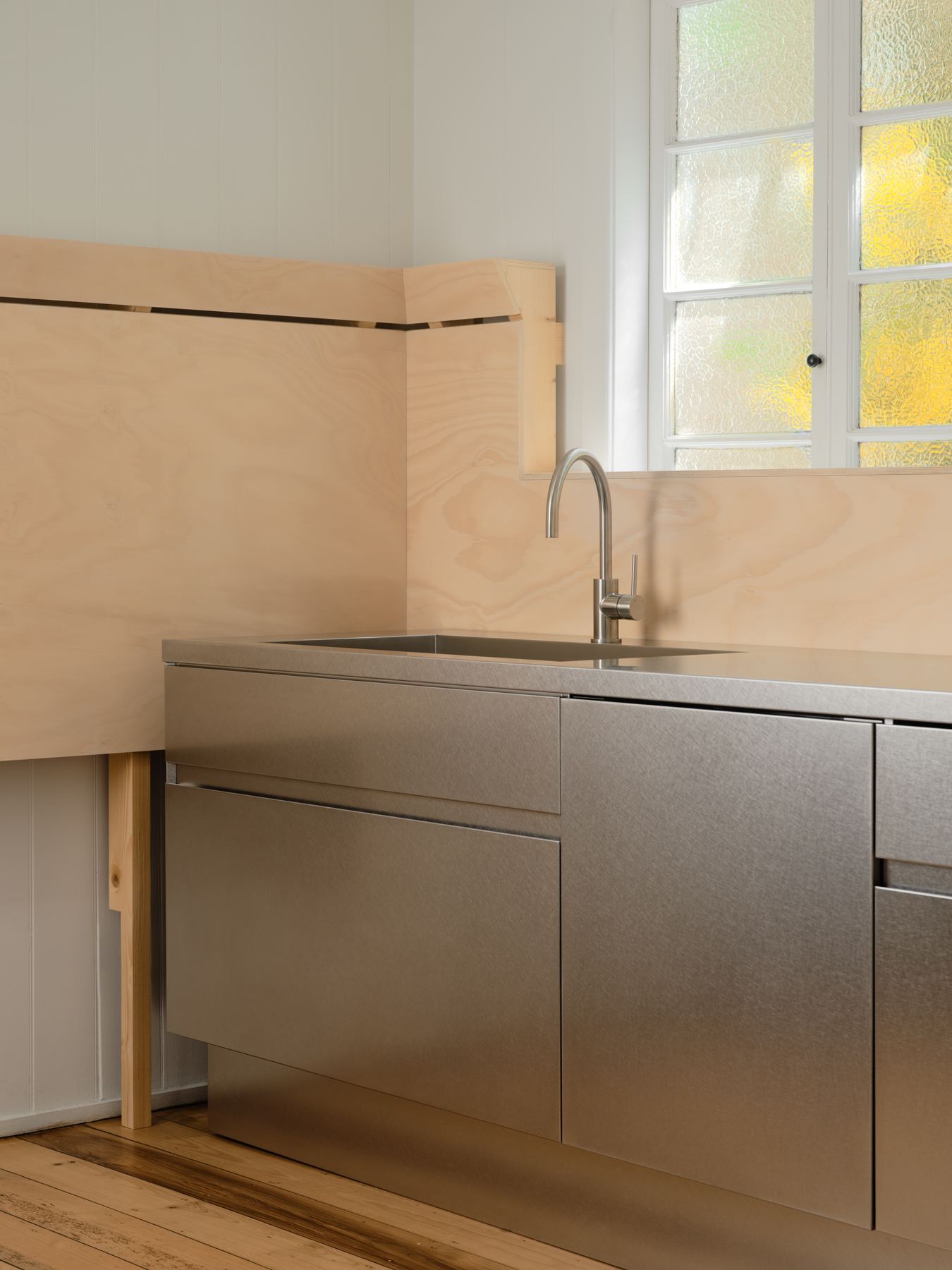
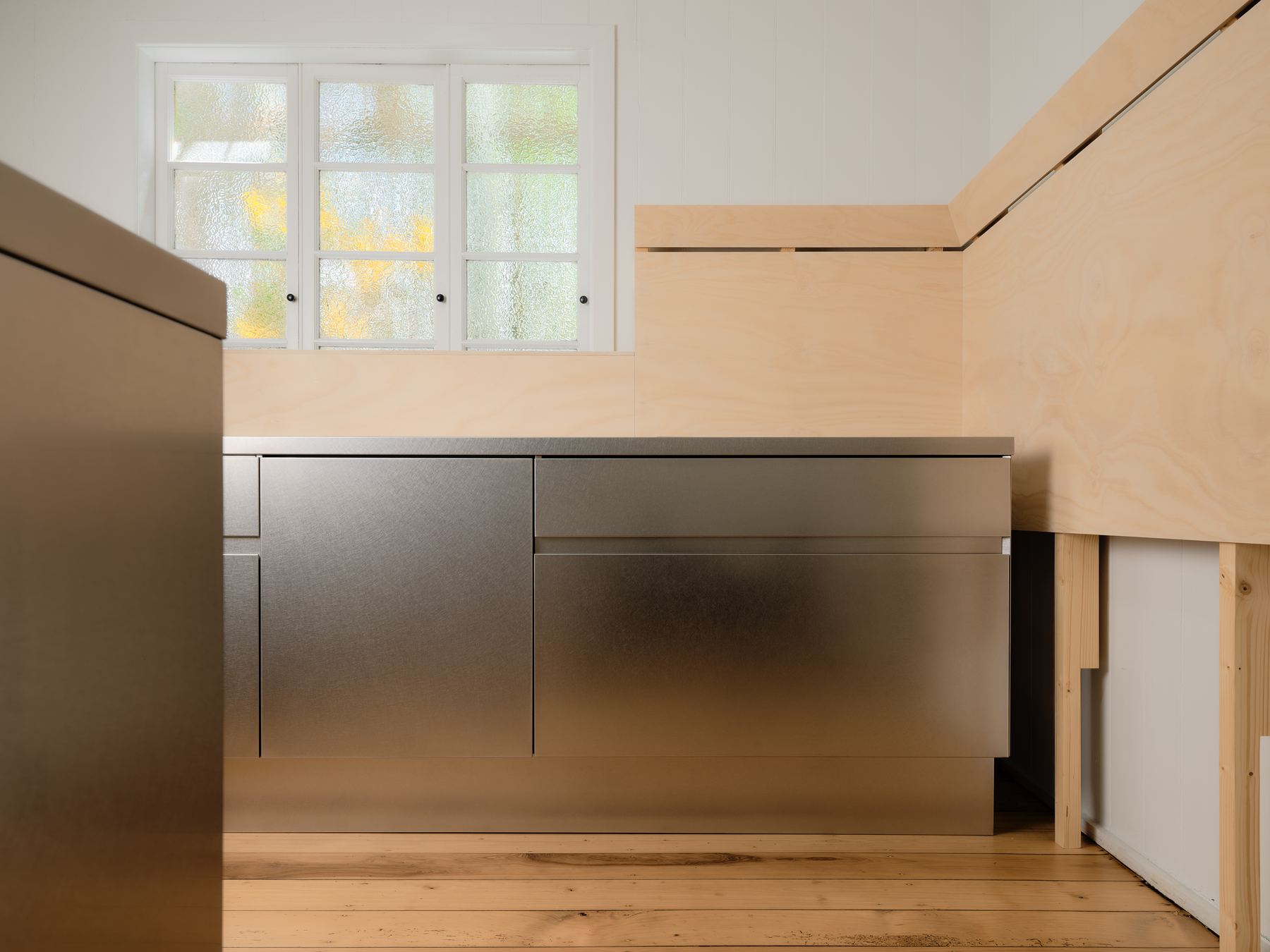
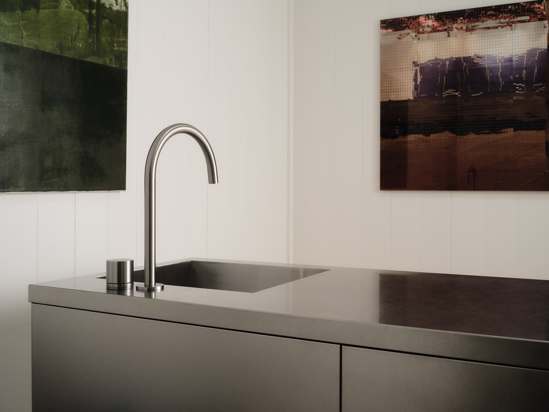
Anook & Co builds kitchens from Japanese stainless steel modules: base units, islands, sinks and taps that bolt together and move house when you do.
Steel kitchens read as commercial to most Australians. The brand had to make the material feel domestic and warm without dressing it up.
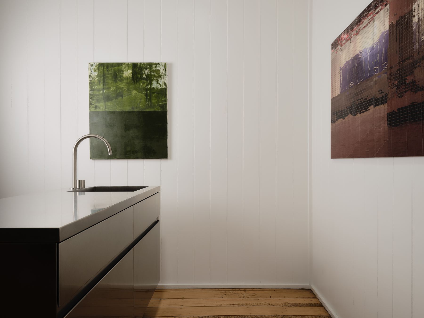
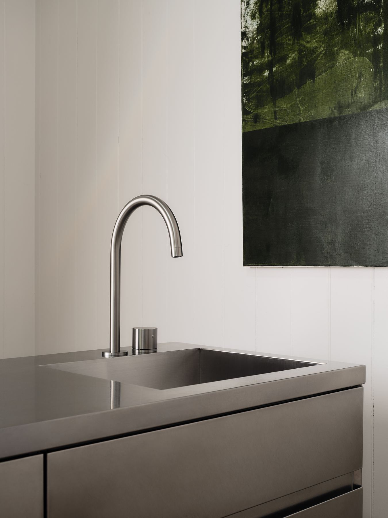
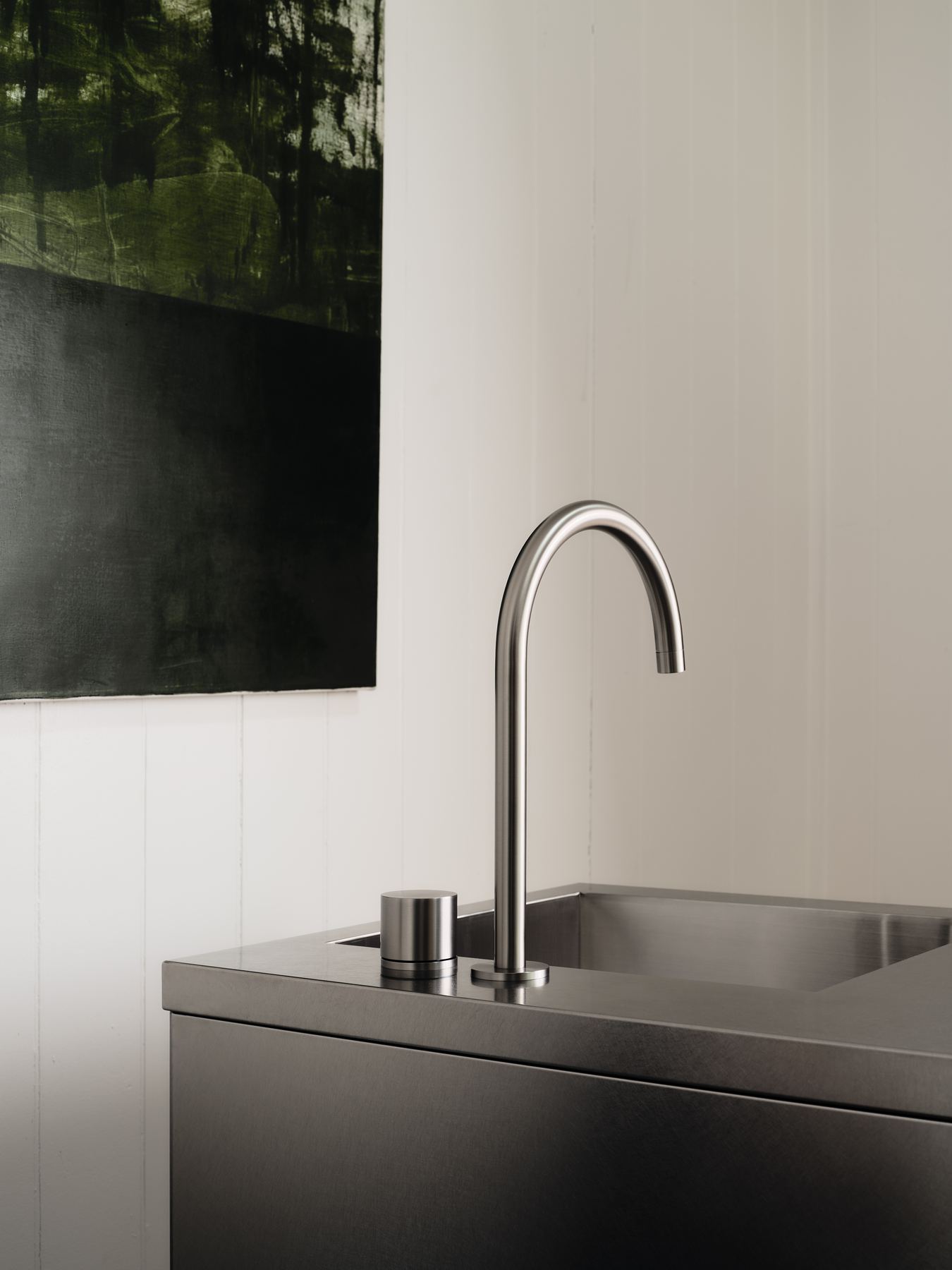
The wordmark is set in one weight and never bold. Hierarchy comes from size and capitals only, so the steel and the owner's art carry the colour.
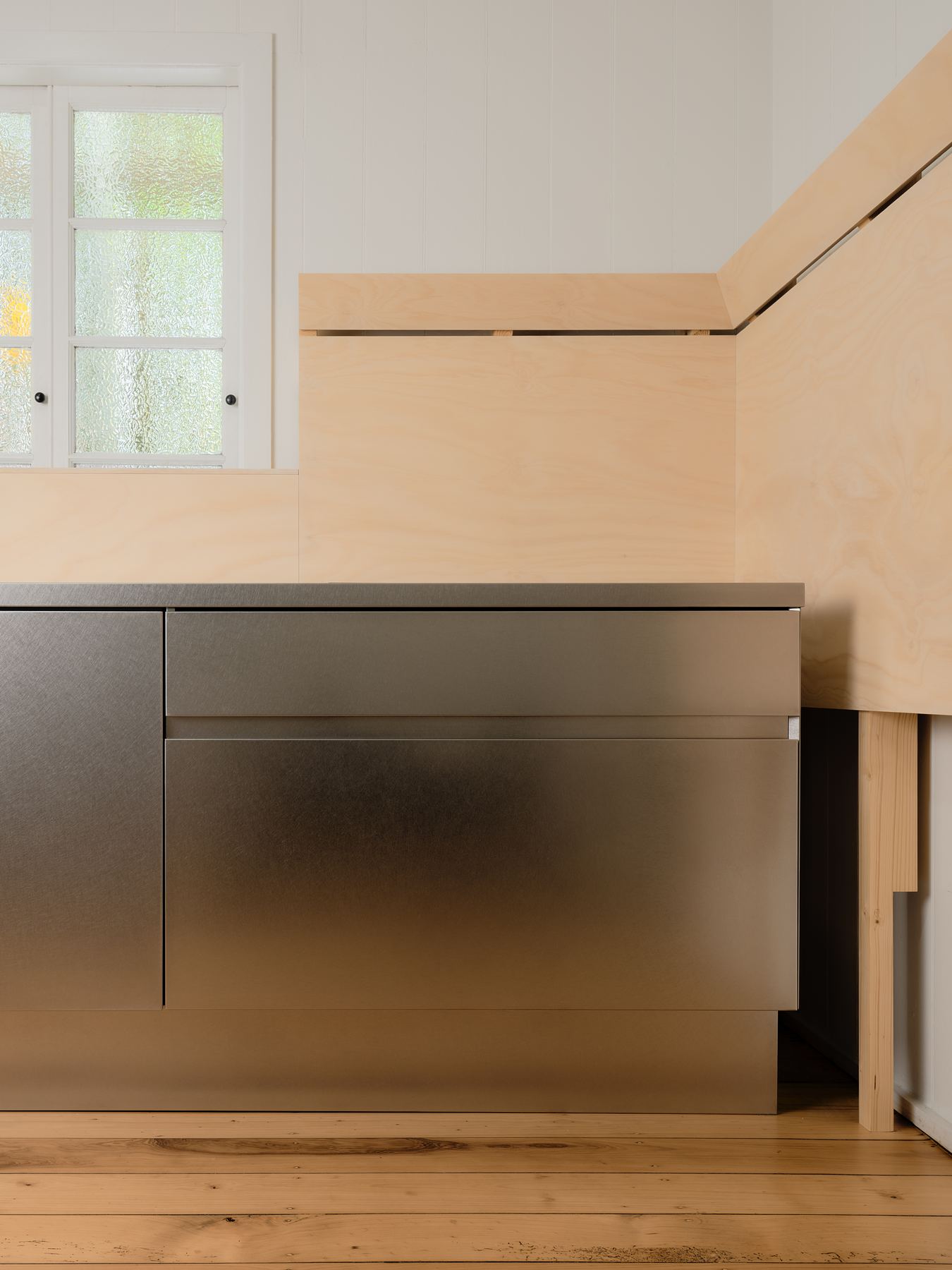
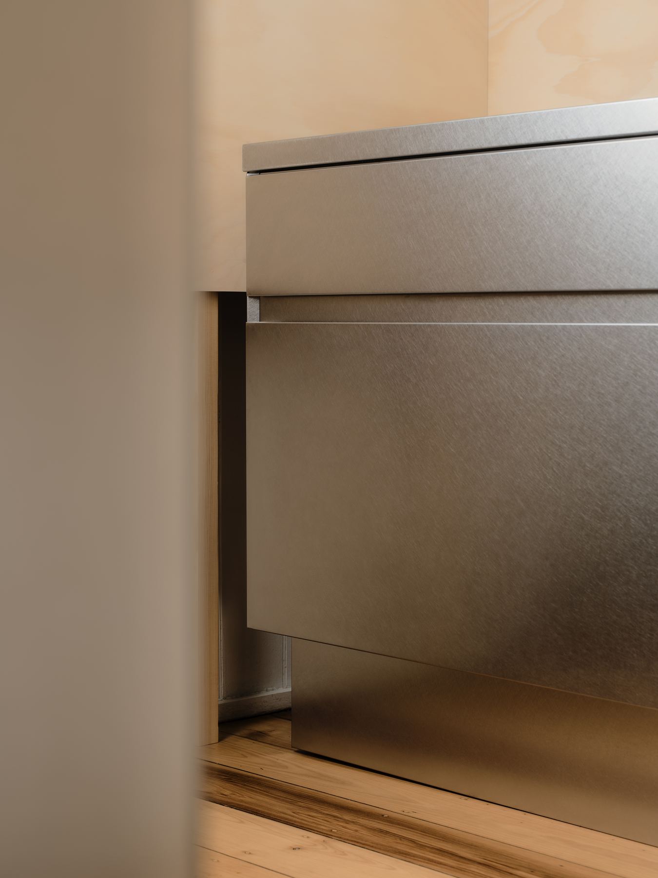
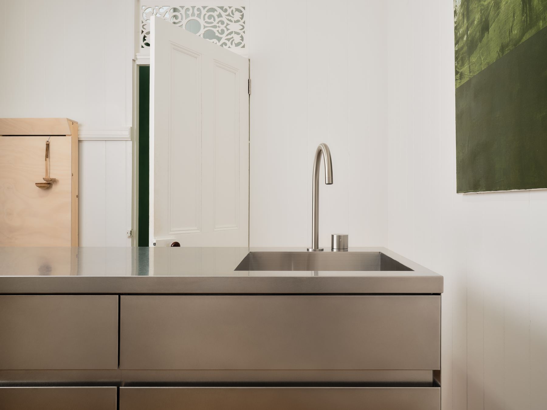
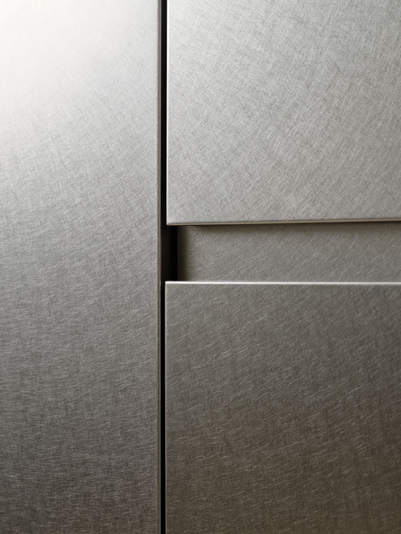
Shot in window light only, so the steel shows its grain instead of glare.
Jack photographed the range in real homes over two days. The same shoot produced the website, the product cards, the launch films and a year of social content.
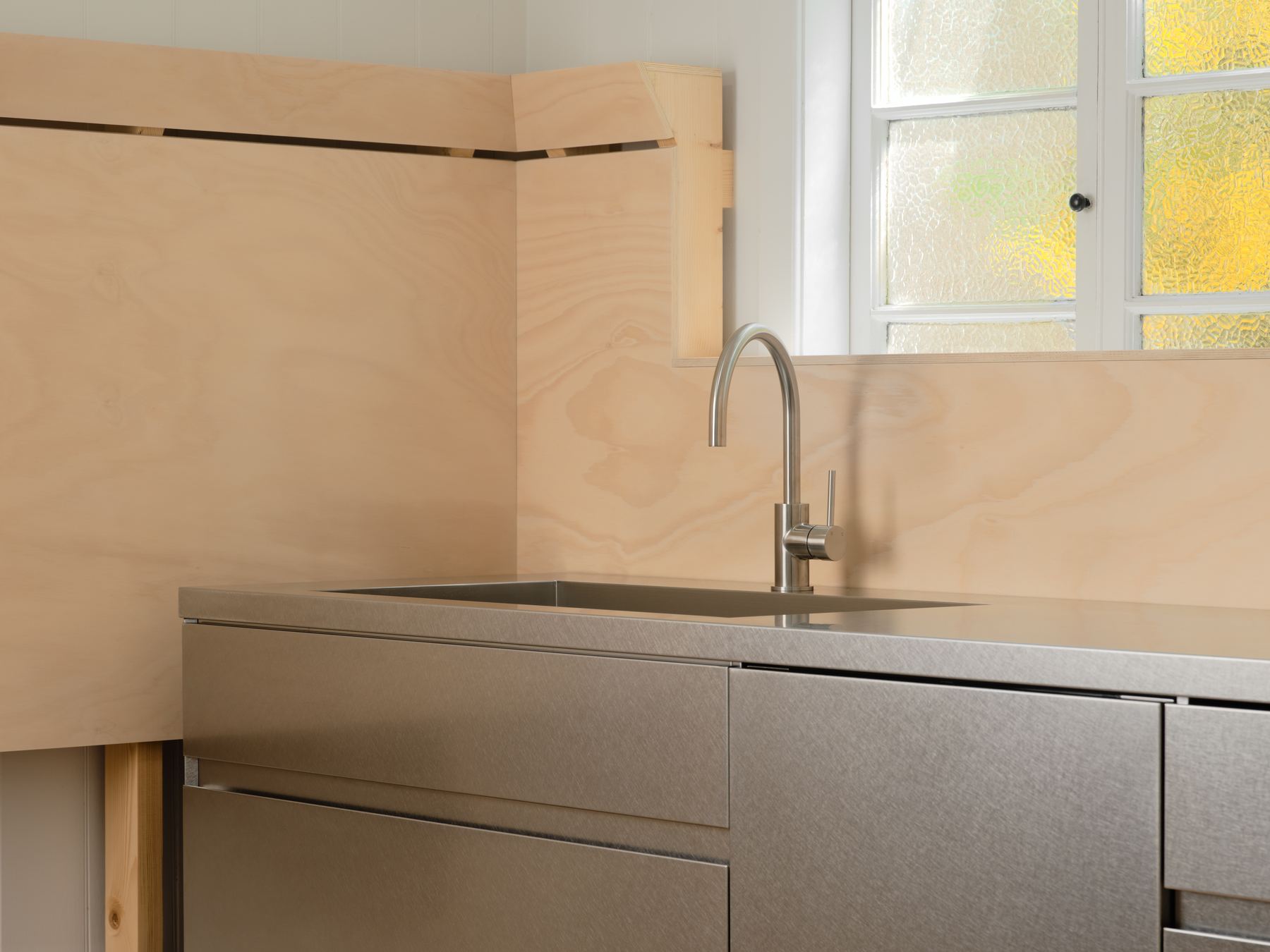
Hoop Pine Ply
Two materials, named plainly everywhere they appear: product cards, guides and the configurator all use the same words.
Overview
Anook & Co makes modular kitchens in brushed Japanese stainless steel and hoop pine ply. We built the brand, the online shop and the photography together, so the three would look like one thing.
The interface is black and white, with one typeface in one weight, hard edges and photographs that run to the edge of the screen. Product names are plain nouns and every button is a verb.
Search was planned with the site map. Guides on planning a kitchen and choosing modules answer the questions people actually type, and lead into the configurator. See the website.
Team
- Strategy, Identity, Website, SEO:
- Liam Warton
- Photography & Film:
- Jack
- Art Direction:
- Liam Warton
Jack - Client:
- Lauren Ibsen, Founder
Project 02
Project 02,
Case study in production.
PlaceholderThis slot is waiting for its photographs. The full case study goes here once the shoot is done.
 PlaceholderPlaceholder
Anook & Co